

There is no “right” way to teach quantitative material. Yet the conventional approach often overlooks the racist history of statistics and frequently fails to acknowledge the biases of data. Instead, teaching should include direct instruction on the roots of modern statistics in addition to opportunities for students to acknowledge their own biases and how they affect the ways data is collected, analysed and interpreted.
This article is a reflection of promising practices I have used to engage students and integrate QuantCrit into my graduate-level econometrics course at a prestigious predominately white institution.
What is QuantCrit?
Quantitative critical race theory (QuantCrit) is a rapidly emerging field seeking to reckon with the racist structures in quantitative research. To adopt QuantCrit is to introspect one’s role within these systems, and to reshape research practices towards a more informed, racially conscious and equitable direction.
- Making space for academic colleagues to think about race as part of pedagogy
- What can we do about the diversity problem in economics?
- What will your anti-racist university look like?
While much has been written on QuantCrit and its application in research, its integration opens a noticeable gap within the teaching of statistics and other quantitative coursework. My goal for the econometrics course I taught was for students to become critical consumers of data and research, while being fully aware of the racist systems that underpin them.
First lecture: how racist is data?
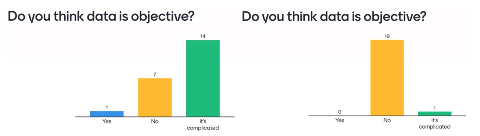
At the beginning of the first lecture in the course, I use the quiz app Mentimeter to gauge student opinions on data objectivity. This question is revisited at the lecture’s end to highlight any shifts in perception. The bar chart on the left (see Figure 1) shows responses to the question “Do you think data is objective?” from one of my classes before the lecture, and the chart on the right shows responses after it. Clearly, students switched from saying “yes” (blue) and “it’s complicated” (green) to the “no” category (yellow).
The first lesson aims to reckon with the racist uses of data, including the eugenic origins and uses of statistics. I introduce QuantCrit as a framework for critical analysis and explain its core tenets. These are:
- The centrality of racism: Race is a social and political construction. Without a critical race theory lens, data analyses can perpetuate racial disparities.
- Numbers are not neutral: The status quo is for numbers to be gathered and analysed in ways that reflect the interests, assumptions and perceptions of elites.
- Categories are not neutral, given or static: Too many categories or too few categories can be just as harmful in masking inequalities.
- Voice and insight: Data cannot speak for itself; data is mute without human interpretation.
- Social justice and equity orientation: A push-and-pull relationship with data to use numbers for justice.
Positionality statements to highlight inherent bias
Every assignment in the econometrics course requires students to analyse real (public) data and develop policy recommendations. For each assignment (from four in total), students are required to write a positionality statement, which is a reflection of our own power and position in society. Our backgrounds, inherent biases and experiences may affect the way we choose variables to include in our statistical models.
This example is a positionality statement from one of my students in reference to an assignment on public health, where students were required to develop a model to predict low birthweight.
My position [for] this [assignment] is as an upper-middle-class white woman, who has received help from an education at multiple elite institutions. I have also not experienced pregnancy nor childbirth. As a result, I recognize that I will never fully understand the health concerns, financial obstacles, and challenges in accessing the healthcare system that are faced by vulnerable communities and individuals who do not come from a privileged background such as mine. I also acknowledge that my background has influenced the assumptions I used to choose the data for my analysis, to generate new variables, and to estimate predictive patterns.
More examples of positionality statements are contained in this systematic review.
Teaching less common statistical methods
Most commonly taught and used statistics rely on parametric assumptions (this is, they assume that the population is normal or can be approximated using the central limit theorem). Parametric methods require on a conservative level a sample of at least 20. We can use non-parametric methods that don’t need these assumptions.
When trying to disaggregate data for the most historically oppressed groups, sample sizes may be smaller than 20. Rather than ignore these historically oppressed groups or lump them into “other”, professors of quantitative courses should teach students to use non-parametric methods alongside parametric methods. For example, when teaching about the use of t-tests, students should also be exposed to the non-parametric alternatives, such as the Mann-Whitney test and the Wilcoxon signed rank sum test.
In statistical models, we often represent identities (for example, race, ethnicity, gender, class or disability) as categorical variables in our model. However, identities are complex and layered. To represent individuals’ intersectional identities, interaction terms can be used in statistical models. Interaction variables (or “interaction terms”) are generated when two or more independent variables are multiplied together – think Latino x woman to identify a Latina, instead of looking at that person’s identities in isolation.
Checking diversity of scholars on the syllabus through images
Over the past year, I’ve displayed author photos alongside their works. As mentioned above, identity is multifaceted, and a single image is just a glimpse. However, this exercise underscores a disheartening realisation that although I tried to include more scholars of colour in my syllabus, it was clearly not enough. Most papers were written by white men, even those about topics that disproportionately affect communities of colour, such as police shootings. This discovery has led me to rewrite my entire syllabus and ensure that more women and people of colour are represented.
Integrating statistics’ past into pedagogy
We are all iterating on how to best teach quantitative courses. For faculty in fields such as health and social science, it is imperative to recognise that the racist past of statistics should be an integrated course component rather than an afterthought or add-on.
These practices are intended to serve as starting points for faculty to rectify their pedagogy of teaching statistics and specifically advocate for the use of numbers as tools for justice.
Wendy Castillo is a lecturer in the School of International and Public Affairs at Princeton University.
If you would like advice and insight from academics and university staff delivered direct to your inbox each week, sign up for the Campus newsletter.


comment