

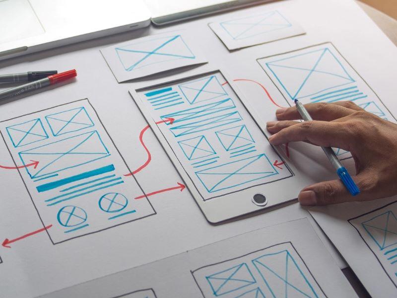
Designing should be a fun, creative process. We use the psychology of design in every aspect of our lives, from the outfits we put together every day to our decisions about what to eat, watch or read. Almost every aspect of our waking lives requires an aspect of design; we just forget we are doing it!
That is the wonderful thing about the design of products and services – they have been designed so well that we fail to see the beauty of their function; we simply use their effortless assistance in our lives. People often say: “Great design just works,” as if the concepts had descended from the sky into the designer’s mind.
- Five steps to making your digital course content more accessible for all
- UX for teaching: designing online courses from a student’s point of view
- 10 smart ways to ace your next academic presentation
Great design takes a lot of work, usually learning from the mistakes of others to avoid making the same errors in the next iteration. Good design requires a keen eye and attention to detail, a wealth of creative knowledge, top skills in some form of software or hardware, and years of experience. All that is true, but if you are focused and use the basics, you can achieve good, simple design that is effective and functional. At the end of the day, that is the level at which most of us are pitching with everyday tasks, whether in our teaching or research work.
So why do so many of us ignore design?
The quick answer: design takes time. Whether teaching or presenting your research paper, it is much easier to slap together a presentation or Word document without thinking about the design of it because the software does the work for you, doesn’t it? Yet does it, really? Software is a tool that can be applied well with basic principles but produces horrendous results if these straightforward principles are not applied.
So just what are these principles and how long will they take to implement?
Choose your font carefully
The holy grail: font choice. There are now thousands of designed fonts out there, but you must use them wisely. You may be tempted to jazz up your work with a fancy postmodern bold serif font or an edgy Sharpie font with a twist, but ask yourself one question: do you really need this font everywhere?
Choose one font for the key title and then use one other font for the body text, with varying point sizes to delineate sections; 18-point, 14-point and 12-point sizes work well, but scale those back if you need to.
Clarify your points with colour
You only need two or tonal variations of each colour. This keeps the project tidy and easy on the eye – and that should be your main goal. Use colour blocks to hold images for consistency, if you have time, and use colour labelling on more complex diagrams and images. When colour labelling you can really go wild with the colours, but aim to use discreet symbols because over-labelling and areas with too much colour will also destroy that well-defined structure you are aiming for.
Should you justify your text?
To justify or not to justify, that is the question when it comes to text alignment. Left justification is a must for Western content, but right justification requires work. Manual formatting, or changing the point size, can tidy up stragglers at the end of paragraphs, but in some cases simply editing the words can improve the overall aesthetic of a text block.
Use space to set the pace
Spacing is the most important factor. Space on a page allows you to take your time when reading. Squashing a lot into a small space helps no one; all it does is give your audience a migraine, and no one wants that. As a rule of thumb, use 1.5 line spacing because it allows the reader to carefully follow the words in a text block.
Margins are also important. They should always be equal – and this also applies to images in boxes. The border should be equal all the way around, unless you are adding text into the frame. People often ignore this and add an awful thin line of colour with two fat edges, which tips the image off-centre. Be vigilant; spacing is your friend when it comes to information.
Quality over quantity
Slow down. Don’t be tempted to convey so much information that no one can read it in one go. Give the viewer the opportunity to absorb the content, to consider what is being said and make suggestions or ask questions. Add three or four points to the slide, paragraph or block and consider how you can use point size and colour to make that content clearer, because clarity is your goal.
Finding the balance between structure and creativity is not easy. It requires refinement, which takes up extra time. You may get frustrated as you make choices through iterations, but the start of the design journey is building up an awareness of how text works on a page – and it is more than worth it. Once you have mastered the above skills, you can move on to grids and Gestalt theory.
Cavell Ord-Shrimpton is course leader and acting head of school in the School of Design at Arden University.


comment