


A simple way to improve the user experience for your students is using colour coding and hand-drawn interfaces, my research shows.
Colour coding helps students to identify and process instructional visual information. Hand-drawn interfaces can provide a better digital user experience. With this in mind, I created a framework for the Study Zone Digital site, which provides study skills online resources for students at the University of Exeter. This framework can be adapted to enhance menus across any virtual learning environment in higher education, schools and colleges.
It is a challenge to design an engaging menu and navigation system for online resources. Many use uniform colour tiles, or tiles with generic images. It can be difficult to incorporate colours when you have restricted branding guidelines provided by your institution.
- Fundamentals of design that will improve your work in every dimension
- UX for teaching: designing online courses from a student’s point of view
- Easy as ABC: design an online course in 90 minutes
When used incorrectly, colours can distract users and create barriers to identifying information in online environments, research shows. Therefore, it is important to apply colour effectively and this can be done by colour coding. In this context, colour coding is a systematic display of online information such as topics or themes by using certain colours to aid website navigation. Colour coding allows educators to categorise, group and present information clearly so online learners can identify topics more easily. These five simple steps explain how to do this:
1. Develop black-and-white icons that represent the topic, subject or specific theme
Depending on your brief, a first step in this process is to develop a set of appropriate icons. I responded to my brief through creating 16 hand-drawn icons. I drew, then scanned and then edited them in Adobe Photoshop. However, you might want to use other methods to create your icons such as drawing with a stylus pen on your tablet or maybe using pre-designed vector icons. Pre-designed icons can be downloaded for free from open-source websites such as Iconoir, Noun Project, Flaticon and Figma or purchased from stock image platforms online such as Adobe Stock, Flickr and iStock. Top tip: make sure that your icons will fit the dimensions of the tiles on the menu that you are creating.
2. Identify the colour palette that you could use for your icons
Once you have developed your black-and-white icons, it’s time to select the background colour. I had to work with a colour scheme from the branding guidelines of my institution. Before starting to add colours to your designs, check your institution’s branding guidelines. I picked a different colour for each icon. I used bright colours with no filters; however, you might want to add gradients or other filters to your designs. Make sure that the colours contrast clearly with the background and icons also show up visibly over the button colour. Bright colours are usually better for colour-coding as they enable greater contrast and thus better visibility of the information being displayed.
3. Discuss and co-decide the use of colours with your colleagues
You might want to discuss the colour palette with colleagues who are involved in the project such as website developers, marketing staff or academic subject specialists. During the process of working out the colours for the designs, I showed the drafts to my colleagues and asked for feedback. I applied their feedback and proposed solutions until we all agreed on the final designs.
4. Use an accessibility checker
Make sure that the icons you create are accessible. This can be done by using a contrast checker such as Web AIM: Contrast Checker and Colour Contrast Checker. It works by inputting the HEX colour codes of the icons and their background colours. Every colour has a HEX colour code and there are many ways to identify it. I use Photoshop to find HEX codes. I double-click on the colours of my designs. Then I copy the HEX codes from a pop-up window displaying the colour information into the Contrast Checker. I then test the icon colour and background colour against each other.
Some of my initial designs failed the testing, so I changed the colour of the icon to white and retested until everything passed. High-contrast icons allow online learners with visual impairments such as colour-blindness or low vision to navigate the content more easily.
5. Upload the designs to create a navigation system for your topics, subjects or specific themes
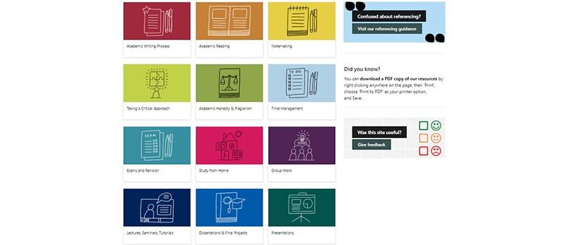
Having uploaded your initial selection of tiles and icons to the relevant platform, you can keep adding to this as more topics, subjects or specific themes emerge. Make sure you group, organise and label information clearly. Limit the number of colours you use because excessive use of too many colours can cause cognitive overload and complicate the site navigation.
If your primary navigation has sub-menus, these could be redesigned using colour coding taking visual cues from the menu item, or tile, each sub-menu is linked to. For example, in our Study Zone Digital, the “note-making” tab has a sub-menu in the same yellow squares to communicate that these subsections belong to the note-making section.
Joskaudė Pakalkaitė is a study skills (digital) coordinator at the University of Exeter.
This advice is drawn from Joskaudė Pakalkaitė’s research papers:
Development of Noise-free Digital Interfaces: Hand-drawn interfaces for consumer wellbeing
If you found this interesting and want advice and insight from academics and university staff delivered direct to your inbox each week, sign up for the Campus newsletter.


comment